Design Collection: Logos
November 18, 2023I’ve had the unique opportunity to create several logos for creative individuals that continue to be in use. Each logo I’ve designed successfully promotes a name and, in some cases, a service offered. Despite not having formal drawing skills, I’ve leveraged my creativity, research tactics, and design eye to create compelling logos that resonate with each client’s vision and audience. This collection showcases how I translate an individual’s ideas and personal connections into a strong visual identity.
- Project Role: Graphic Designer
- What I Learned: Client Consultation, Iterative Development
- Tools Used: Adobe Illustrator, Canva
Seayoung Yim
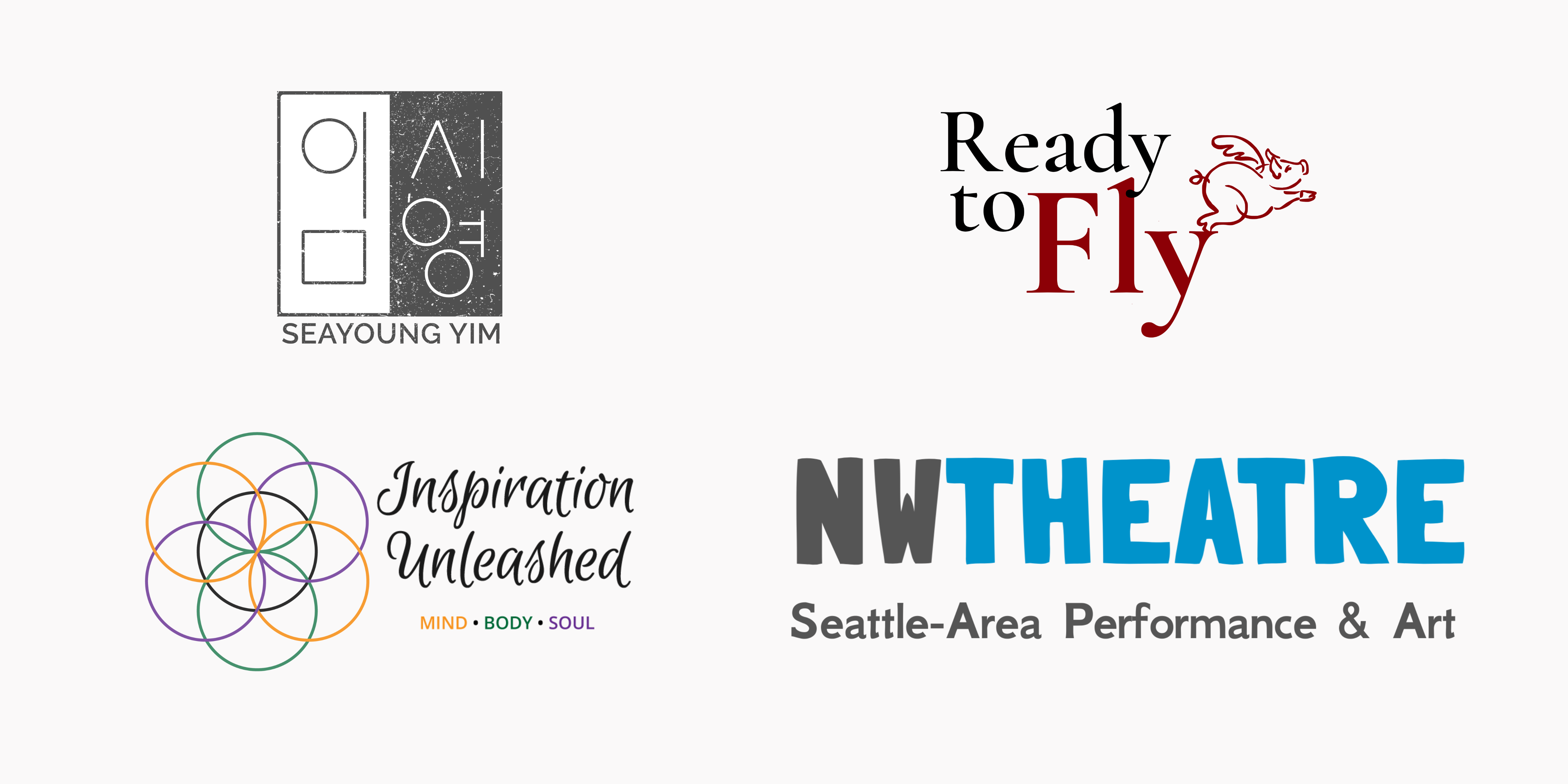
Seayoung Yim is a Seattle playwright and activist based in New York. Seayoung’s logo is a modernized version of her name in Korean characters, digitized to look like a stamp. As an artistic representation of Seayoung’s name in Korean characters, the stamp incorporates her heritage with a modern sense of style. I used a scanned photo of the printed stamp to design a digital version in Adobe Illustrator. I layered in a texture I found through Spoon Graphics to give it a worn feel.


Your Inspiration Unleashed
In her original site design, Victoria used an image of several gold, intersecting circles as her logo, inspired by the seed of life. I used that as inspiration to focus on a simpler, clearer image that could still incorporate the spiritual aspect of Victoria’s coaching and be flexible on its own or behind text. The circles represent the “seven pillars of wellness” distilled into three color pairings in circles of gold for “mind,” green for “body,” and purple for “soul,” with a seventh circle to represent the manifestation of the whole. The gold, green, and purple are used throughout the site as solid colors anywhere the mind, body, and soul are highlighted.
Ready to Fly
The hyperbole of “when pigs fly” is what Fiona uses to inspire others to help them realize their dreams, turning the impossible into reality. I searched for free-to-use illustrations of pigs that rode the line between whimsical and professional. I retraced the line drawing and paired it with the serif font Cormorant Garamond to create a fun contrast. I selected a strong red that conveyed sophistication and power. In this logo placement, I love how the pig appears to be taking off from the serif of the ‘y’!


NW Theatre
NWTheatre.org is an independent online publication and performance calendar for local arts coverage in the Seattle area with reviews, interviews, and features emphasizing financial accessibility and underrepresented voices. Since the primary goal for the logo was to be approachable and easy-to-read, we selected Londrina Solid (sans serif) for the text of “NW Theatre.” This font was intentionally developed to be reminiscent of city signage, which needs to be readable at a distance. The tagline is usable with or without the font for what has become a recognizable brand.
Categorized in: Graphic Design, Project

