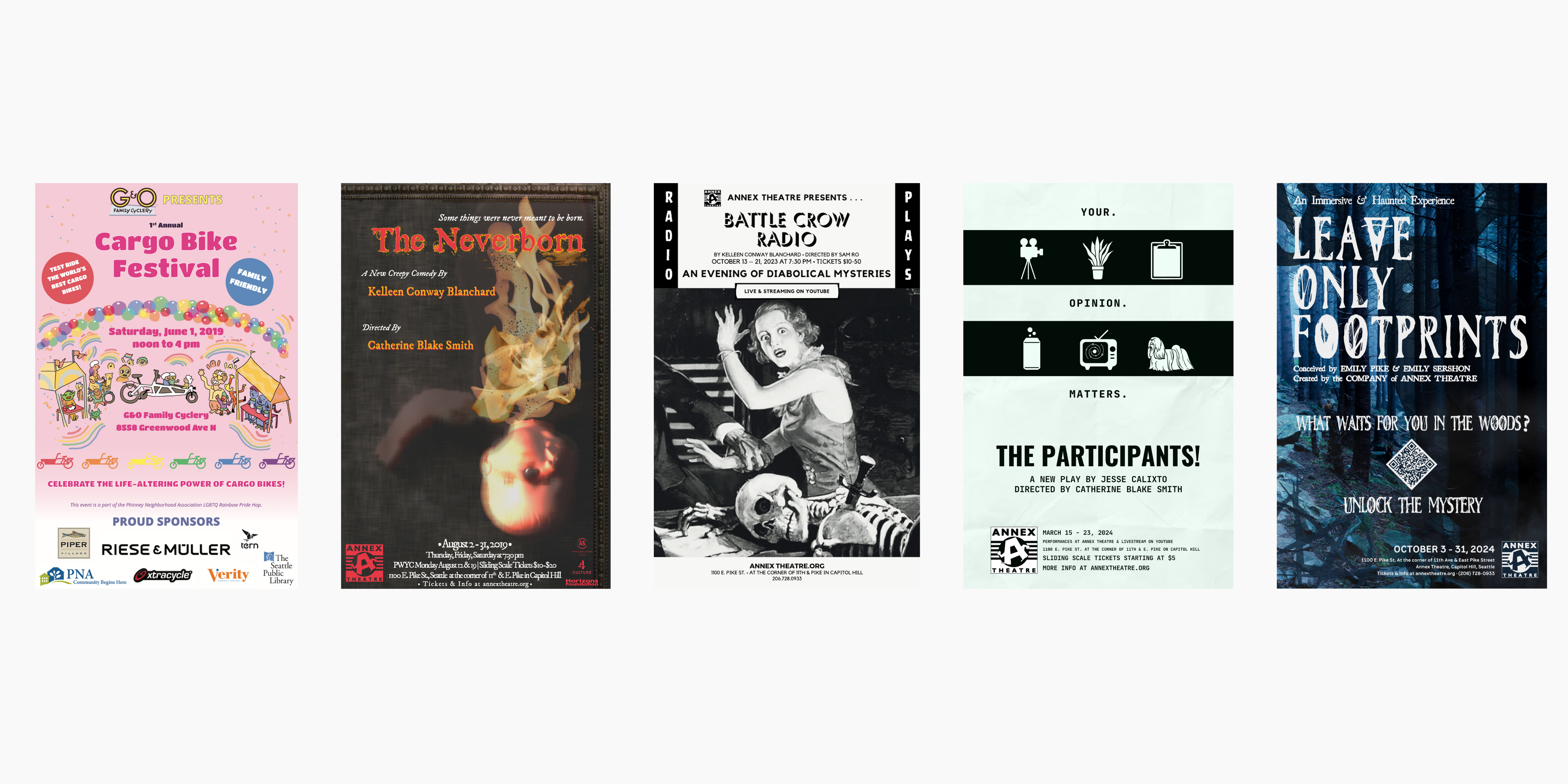
Design Collection: Posters
October 1, 2024Working on event posters is always a rewarding challenge. They must contain visuals that clearly convey a feeling or story in one go. The selected colors must look good both on screen and in print, and align with the organization’s branding identity. Also, there is often a lot of required text that needs to be readable at a glance. Then, the posters are widely distributed across the city in coffee shops, store windows, and on community boards to not only remind folks who are familiar with the organization that the event is happening, but also draw in new audiences. My favorite part of designing posters is getting feedback, when I learn what does and does not resonate people familiar with what’s being promoted. Primarily, I’ve designed posters for friends’ events and productions at Annex Theatre.
- Project Role: Graphic Designer, Project Manager
- What I Learned: Brainstorming, Client Consultation, Iterative Development
- Tools Used: Adobe Illustrator, Canva

The first annual cargo bike festival was hosted by G&O Family Cyclery in 2019. (Unfortunately, it was the only one, due to the COVID-19 pandemic and eventual closure of G&O.) I was hired to design a poster that was distributed around the neighborhood, incorporating an illustration of happy families and neighbors celebrating cargo bikes. I was also required to include details about who could attend and what they could do at the event, since it was the first festival of its kind in Seattle. I leaned into the rainbow color palette, and hand-selected colors directly from the illustration to create the complimentary components. We also were required to include sponsor logos. Looking to other similar posters for inspiration, I saw that there was often a distinction between the sponsor section and poster background, which I chose to create with a gradient fade.
In August 2019, I got the opportunity to direct a full-length play by my favorite playwright, Kelleen Conway Blanchard. In the play, The Neverborn, a haunted painting of a baby hunts down a pair of orphans who are searching for their Mother, who gave them up to focus on her dangerous scientific experiments. Initially, we wanted to photograph a baby doll on fire, but that was difficult to capture on film. I also wanted to incorporate a sense of movement, because the picture of the painting begins talking to the Detective character (but only in their head). I created the effects through an organic process of experimenting with photoshop techniques to continually blur and layer the photographic image under various textures.


After lockdown, Annex Theatre presented its first in-person production in October 2023, Battle Crow Radio, again by Kelleen Conway Blanchard. A friend of mine mentioned that the plays reminded him of Tales from the Crypt, which inspired the vertical text at the top of the poster. Then I paired that text with a title font that evoked the 1940s. All of this was combined with a free-to-use image sourced by the playwright. Ultimately, we were able to create a dynamic image that conveyed the subject matter and retro style. Although the original image was in color, I went with black and white to emphasize the contrast and make the text more readable.
In March 2024, I directed THE PARTICIPANTS!. In the play, four strangers join a focus group that goes terribly wrong. I selected key elements from the show and represented them as icons:
- Camera: The focus group is filmed, and they eventually think they’re being pranked.
- Potted plant: In Act 1, it’s used as a bathroom, and in Act 2, it talks to a character in a flashback.
- Clipboard: The focus group leader naturally has a clipboard!
- Beer can: One character drinks four beers in Act 1, since he’s headed to a party afterward.
- Cosmic TV: By the end, there’s a video component with the characters ending up in the cosmos (spoilers!).
- Lhasa apso: One character misses her dogs that she had to leave behind when she moved to town.
Instead of black and white, I was inspired by the green of the plant (named Winston) and used pale and dark greens to emphasize the contrast.


Leave Only Footprints was a devised haunted house that took over the entire space of Annex Theatre. Because it was created by the ensemble of designers and writers, when we were creating the marketing components, we knew very little about the show. We did know that there was a creepy element of an unknown force leading to a missing hiker in the Pacific Northwest woods. For the creature, one of the producers drew a horned figure with claws and horns. I created a custom title based on a free-to-use Halloween font with embellishments designed after spiderwebs. For the body font, I discovered the perfect typeface, styled after National Park signs. The results were versatile, and I was able to create variations for both print and digital media advertisements.
Categorized in: Event, Graphic Design, Project

