Graphic Design: Season 38 at Annex Theatre
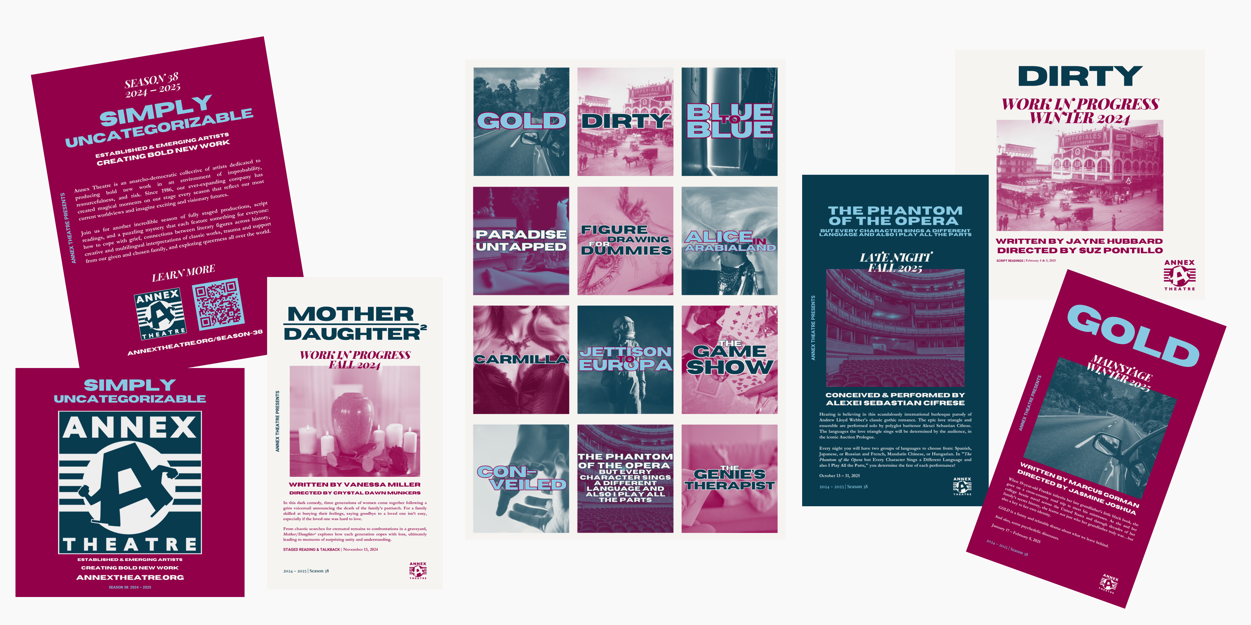
December 2, 2024In 2024, Annex Theatre selected its first full season of productions after the COVID-19 pandemic/lockdown era. Although we had started to skip counting seasons in the interim, dubbing the next period Season 38 (2024 – 2025) caught us up to Annex Theatre’s “age” (which will be 40 in 2026). As the current Marketing Director and person in charge of social media, website management, and email communications, I was excited to take on the designs for a season announcement, but was struggling with how to find a common thread between the shows, especially since they weren’t all plays. For the first time in many years, there will be staged readings with talkbacks and off-night productions alongside full mainstage productions.
Selecting the Style
In collaboration with designer Charlie Harding Morrison, we developed a unified color palette that has now allowed me to “color code” each type of production as I continue to develop new media. We also modified a couple of fonts (Horizon and Playfair Display) to give a strong contrast between sans serif and serif. Then we chose Roboto for the body font because of its clear readability and balance between the two. In order to keep myself on track, I created a quick style guide that I now use to pull various elements:
Making the Announcements
In this season, there are 14 productions, two of which were already in production by the time we were prepared to announce our selections. We were able to include all of them in the rollout on social media, which naturally resulted in the most engagement in our channels, especially on Instagram.
Now that we have audiences in the space again, it was imperative to create physical media. I developed an oversized poster for the space (measuring 18″ by 26″), which includes the text from our initial social media rollout and a QR code to our website. Because Annex Theatre produces all new work, including the QR code allows things to be mutable and flexible, which is inevitable. In between the time when I designed and printed this poster, we’ve already had two creative team changes for upcoming productions.
In addition to a poster, I also designed and printed a postcard (measuring 4″ by 6″), which just features the titles of each production, minimizing text and increasing the visual impact of the associated stock images. By the time I created this postcard, two productions had passed, and the 12 fit nicely on the page. Each mainstage image is in teal with light blue text, the “works in progress” (staged readings) are in red with dark teal text, and the off-night productions are a mix of the blue and red colors, with the neutral off-white for text. I also add embellishments to the fonts to make them pop.


Choosing a Tagline
Overall, the toughest part was coming up with the tagline. In the Before Times, we’ve brainstormed collectively on what we think ties all of the productions together, but this season I simply didn’t have the time. In the end, I didn’t generate the one for Season 38 by myself: the Managing Director mentioned it in one of our more recent grant proposals and I ran with it. But it was too good not to use, especially since we are producing a heavily eclectic mix (sheerly by the number of productions). Now the challenge is remembering how to spell “uncategorizable” because although Merriam-Webster recognizes it, most spell checkers do not.

Categorized in: Graphic Design, Project


